
Etsy Homepage Redesign

Project Walkthrough

Presented by Kyle Johnston

But first, some context:

Etsy is a two-sided marketplace.

Over 86M buyers visit for unique items they can’t find anywhere else.

With over 5.6M sellers and 100M items, a key challenge is matching a buyer with the right item.

The End

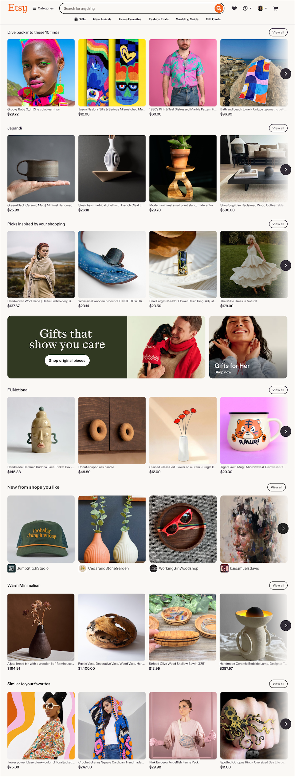
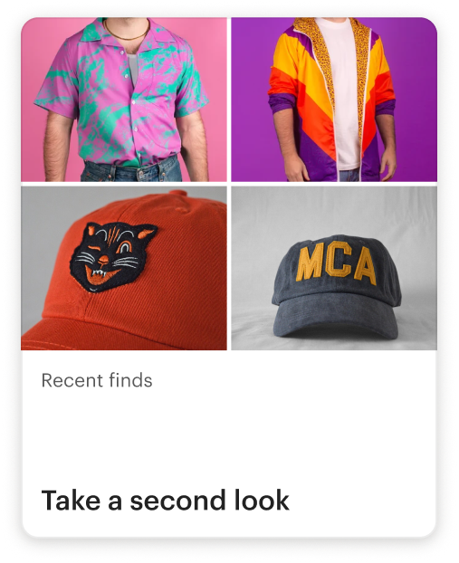
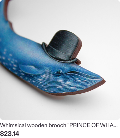
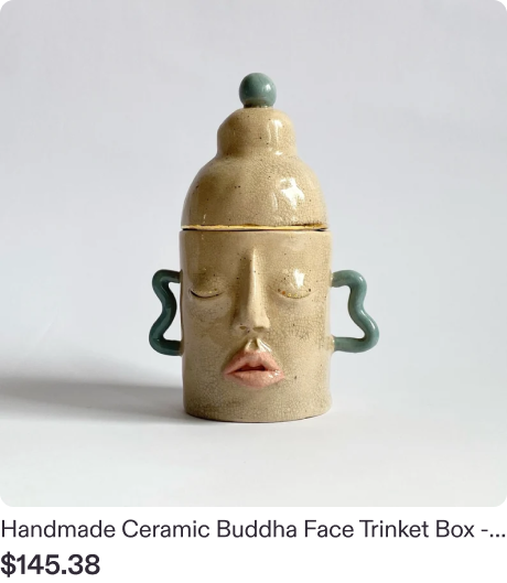
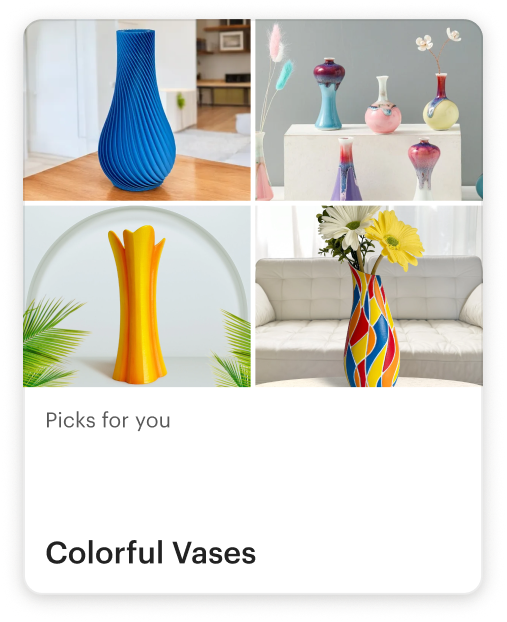
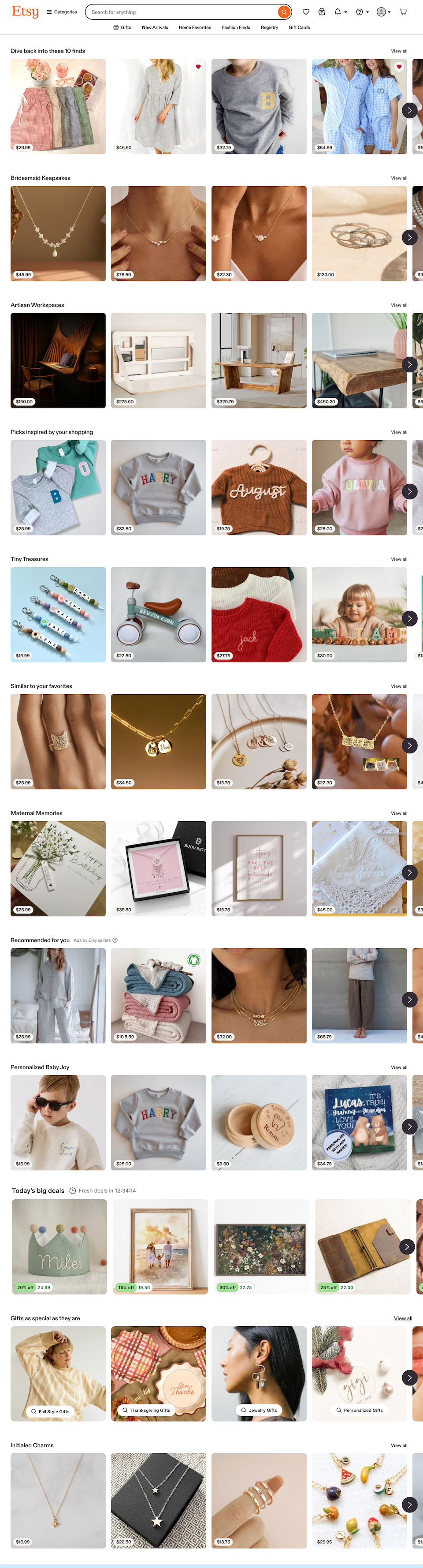
I created a carousel-based design that scaled to support 65,000 themes, all personalized and ranked for each buyer across desktop and mobile.

Impact

+$13M

Revenue

+1%

Conversion rate

+10%

CTR

Jul–Sep 2025

Etsy homepage, today

Design principles I used to guide this work:

Improve before you add.
Watch for: an ambiguous problem, tackled first by removing content and testing, then by personalizing.

Let the prototype drive the conversation
Watch for: a coded prototype, tested with users, that got my PM, Eng, and stakeholders aligned and excited.

Zoom out before you solve.
Watch for: a system that flexed across thousands of theme variations instead of a single fixed module.

The Beginning

May 2024. I joined a new squad focused on Etsy’s homepage. Engagement analysis showed that discovery was a weak spot, so we started there.

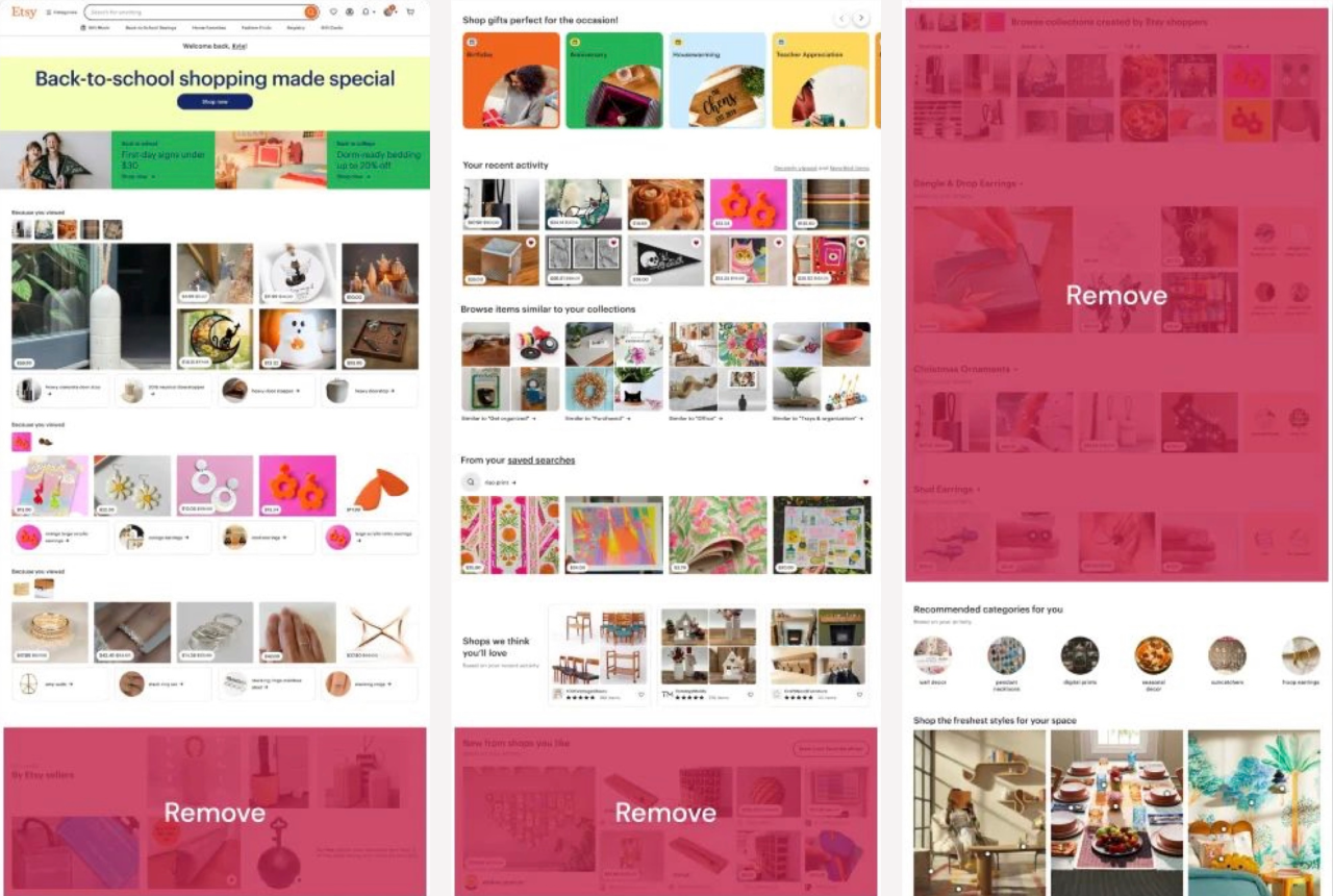
In our first experiment, we removed distracting, redundant content, increasing overall engagement by 1.1%.

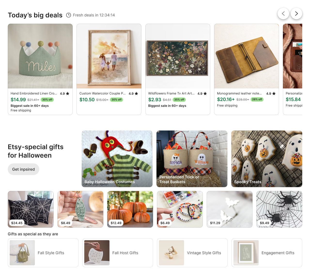
Next, we added new modules to expose buyers to more shopping ideas. The modules were dynamic, diverse, and fresh, but they weren’t personalized, and engagement was flat.
The Spark

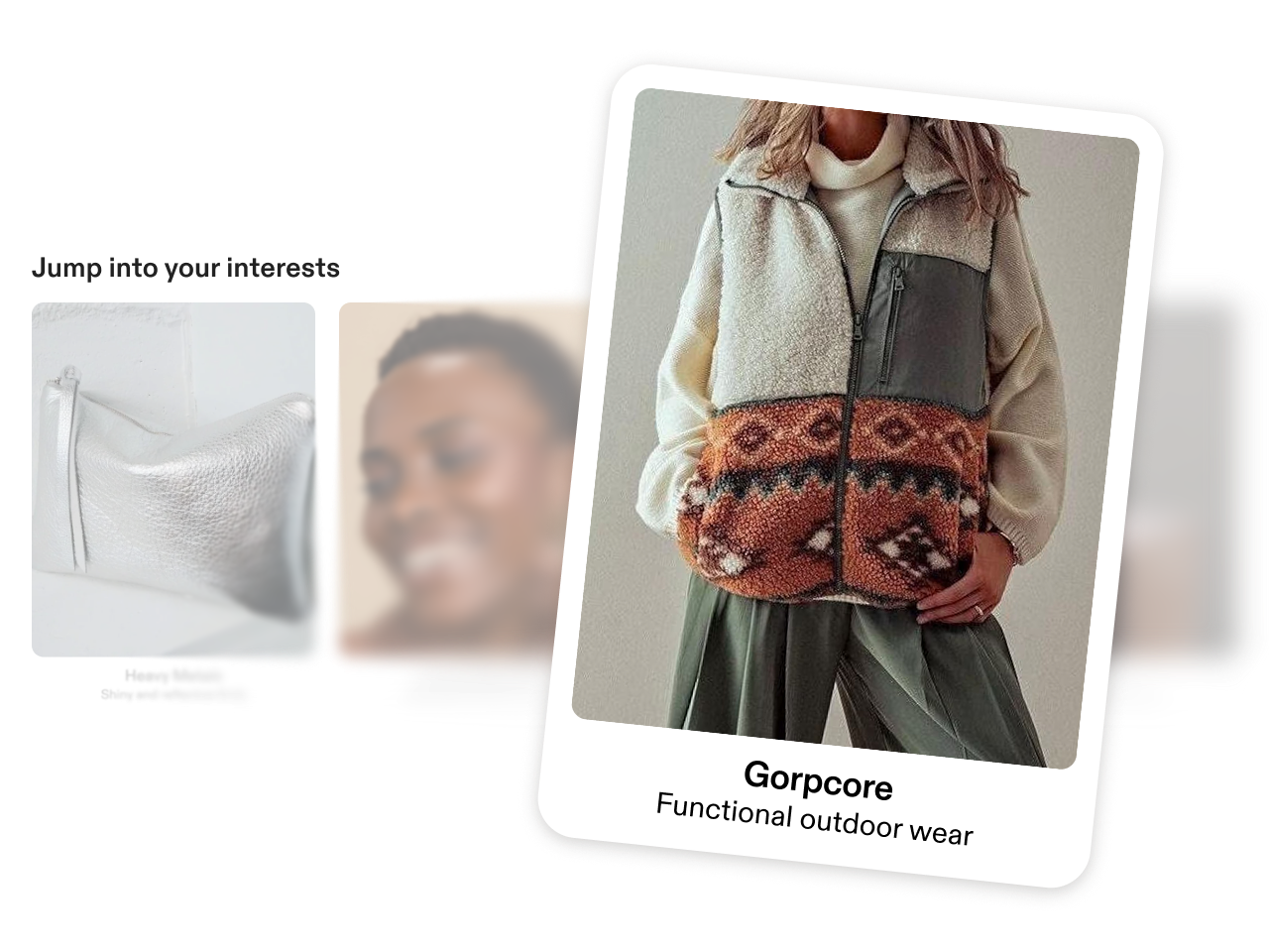
The first spark of promise for discovery content was personalized themes.

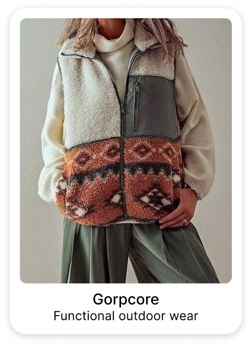
Themes are collections of items grouped by aesthetic or occasion, not just category. They’re curated for quality, so they highlight the best of Etsy’s inventory.

Themes had titles but no descriptions, so I used Gemini to generate on-brand descriptions at scale. That approach became part of the production theme pipeline.

The combination of personalization, engaging content, and UX drove a 1% lift in homepage clicks.
The insight

Personalized themes were engaging, but the volume of content was too low to serve the broad interests of Etsy’s buyers.

The opportunity

We had a new, LLM-scaled dataset with 8,000 themes, matched and ranked for each buyer.

My challenge

The existing design, with a mix of independent modules, couldn’t scale to support the new dataset. We needed an all-new approach.

My solution

Building confidence

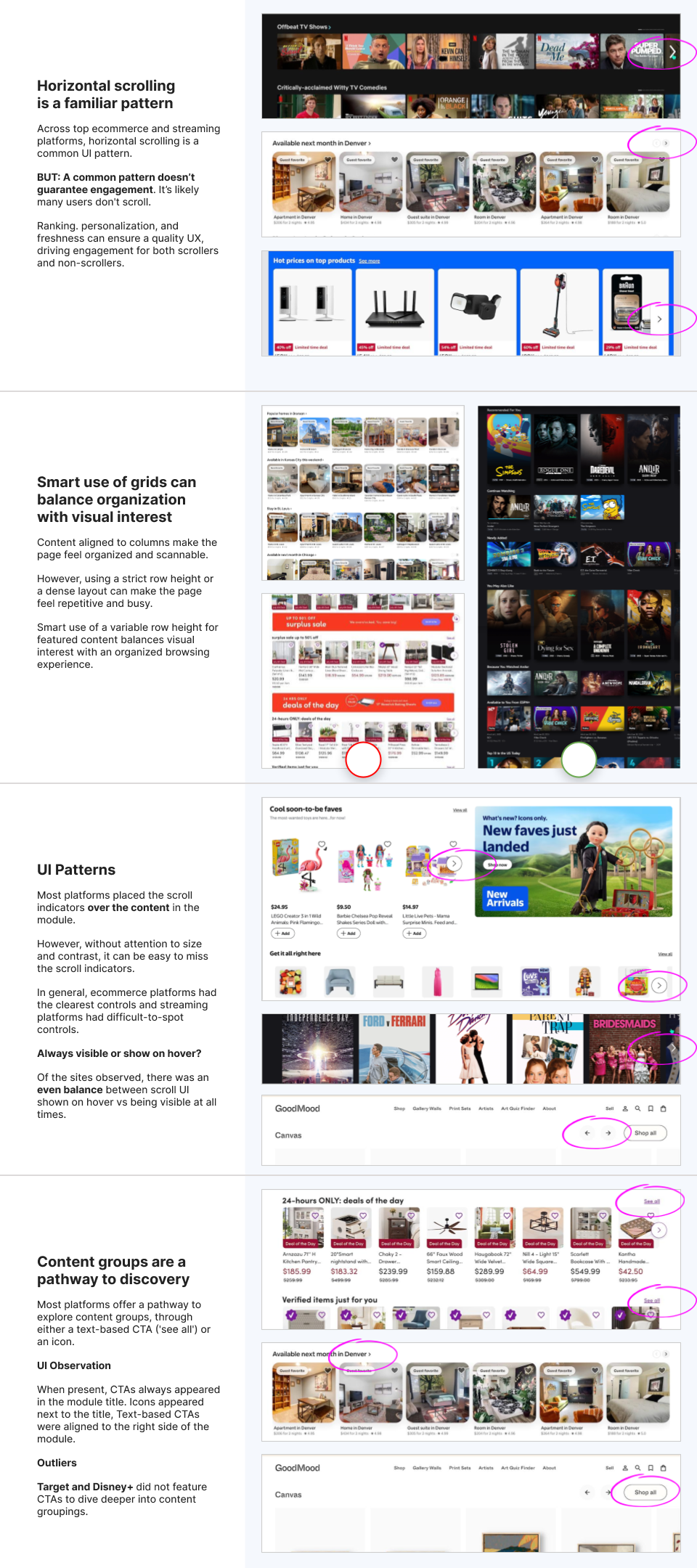
In addition to the prototype and user research, I did a UI audit. I compared our approach with best-in-class ecommerce sites, other two-sided marketplaces, and streaming platforms. I highlighted UI and UX patterns to prompt discussion with my team and stakeholders.
Experiment results

The first experiment exceeded our expectations:

We blended six personalized themes with unpersonalized content—themes had a 2.5× higher CTR.

Overall, the new experience drove more than $9M in revenue, giving us a strong foundation to build on.

As we learned how people used the new experience at scale, we improved the design, content, and data, driving more than $4M in additional revenue.
Where I’d start on Care Access Network

Improve before you add: What decisions do partners need to make from reporting, and what’s getting in the way?

Let the prototype drive the conversation: Where do prototypes help most, and what fidelity do partners need to make a decision?

Zoom out before you solve: Which partner requests keep coming up? What’s the problem behind them?

Thank you!

—Kyle Johnston

Appendix

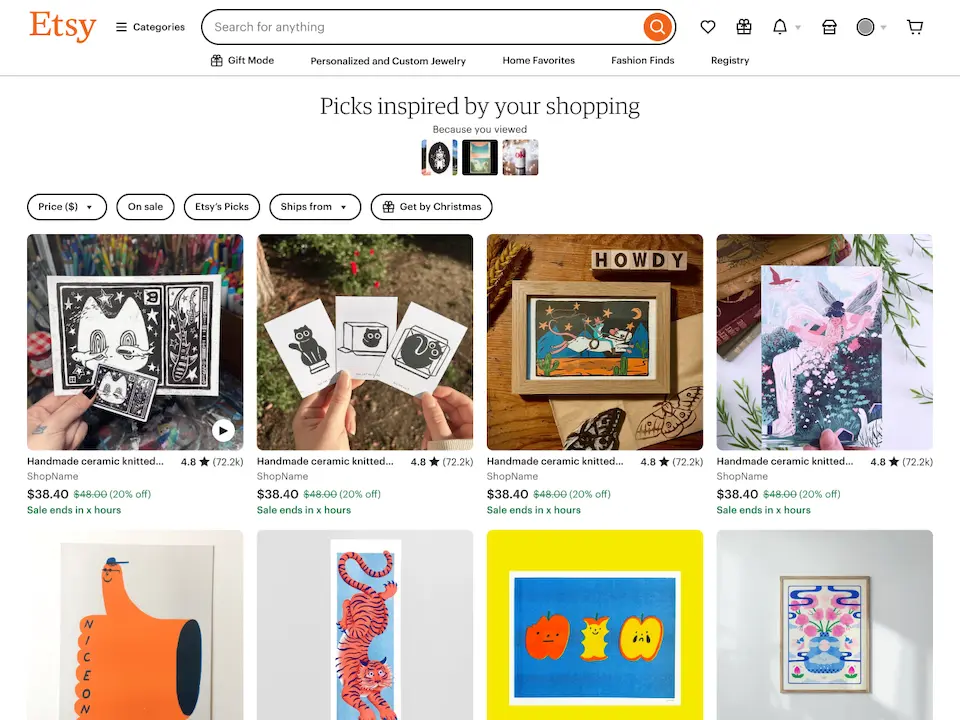
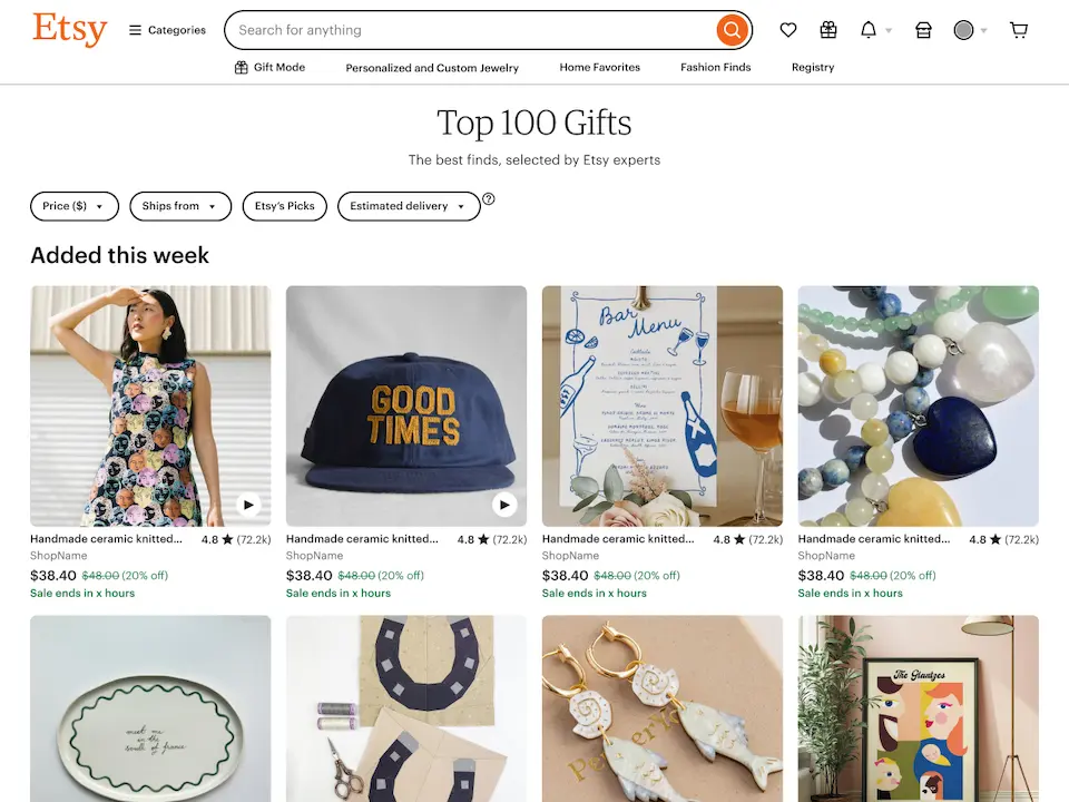
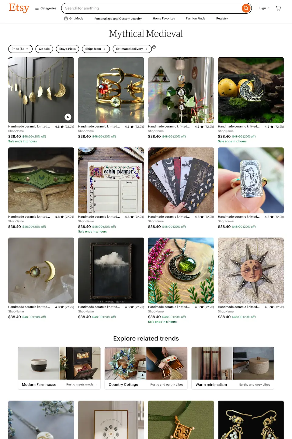
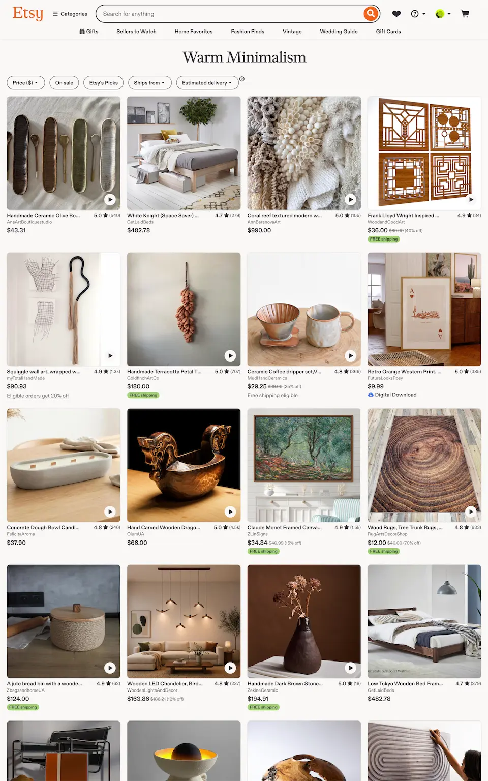
Theme landing pages

As we developed personalized themes, we realized landing pages were a weak spot in the experience—there were no pages on Etsy that supported browsing themes.

I defined the strategy for the landing pages and designed a flexible system that expanded beyond themes to support active shopping missions, similar items, and campaign landing pages for email and merchandising.

Our first experiment showed strong engagement, with a 42% CTR, so we launched the page to all users.
The prompt I used to create this presentation:

  • I’m working on a presentation and I want to visualize it as a web page. I’m picturing it as a long scrolling page with anchors or headings for each slide or section.
  • Each slide should support text and visuals, both separately and side by side. Ideally, I would be able to embed interactive elements like prototypes.
  • Completely open about the technology used to create this. I want to use whatever is best for the outcome I’m trying to achieve.
  • I should be able to run this locally in a browser and share it via Zoom or Google Meet. I also want to upload it to Cloudflare so I can share it.
  • Please ask any questions that would help you deliver a great recommendation.

After the first experiment, my PM focused on expanding our dataset from 8,000 themes to 65,000 themes. To support that effort, I signed up for a PM rotation.

The focus of the rotation was developing and launching Home Hub, a feature that condensed recent activity into a compact module at the top of the homepage.

I wrote a full PRD, defined measurement goals with our analyst, planned experiment scope and deliverables with the lead engineer, and analyzed the experiment results.

Home hub experiment